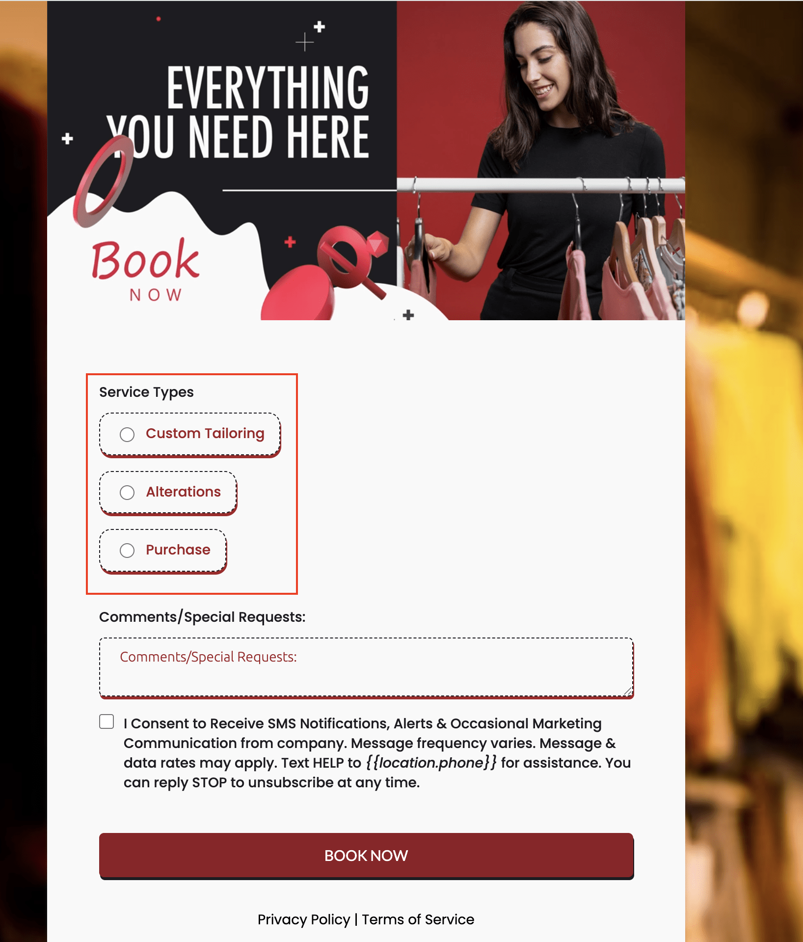
Looking to make your forms, surveys, or quizzes more visually appealing and easier to use? A new bubble style design option for radio buttons and checkboxes offers a modern, rounded look that helps your customers engage with your forms on any device.
📌 Why This Matters
Forms are a key part of how you connect with your customers — whether collecting feedback, preferences, or important information. Having clear, attractive choices helps users understand and complete your forms smoothly, reducing frustration and increasing response rates. The bubble style offers a fresh, inviting look that can improve user interaction without changing how your forms work behind the scenes.
✨ What’s New
- Modern Bubble Design: Rounded choice fields provide a clean and appealing visual alternative to traditional checkboxes and radio buttons.
- Easy Style Switching: Quickly swap between the standard classic style and the new bubble style right in the form’s options.
- Better User Experience: The improved clarity and interactive feel make selecting options straightforward for your customers.
- Responsive Across Devices: Whether viewed on a phone, tablet, or desktop, your forms will display beautifully and function flawlessly.

🛠️ How to Use It
- Step 1: Add a radio button or checkbox field to your form.
- Step 2: Open the Options tab within that field’s settings.
- Step 3: Choose your preferred style:
- Standard – the classic square style.
- Bubble – the updated, soft rounded design.
- Step 4: Save your changes and preview the form to see the bubble style in action.

💡 Pro Tip
Using visually clear and inviting choice fields can increase form completion rates, helping you collect more valuable customer insights that can drive your business decisions.