Creating a website that looks just right on every device is important for any small business owner. Now, you can adjust the size of each element on your pages with exact custom height and width settings. This means you have more control over how your content appears and feels, without the need for complicated coding.
📌 Why This Matters
Different devices show websites in different ways, and having control over the size of your website’s elements ensures your visitors get the best experience whether they’re on a phone or a desktop. These custom size controls help you maintain consistency and keep your design neat and visually appealing no matter the screen size.
✨ What’s New
- Adjustable Sizes with Multiple Units: Choose from pixels (px), percentages (%), em, rem, vh, vw, or auto to fit your design needs precisely.
- Device-Specific Controls: Set different sizes for desktop and mobile views, so your website always looks great.
- Flexible Column Layouts: Make horizontal columns work better with spacing options like space-around and space-between for a balanced look.
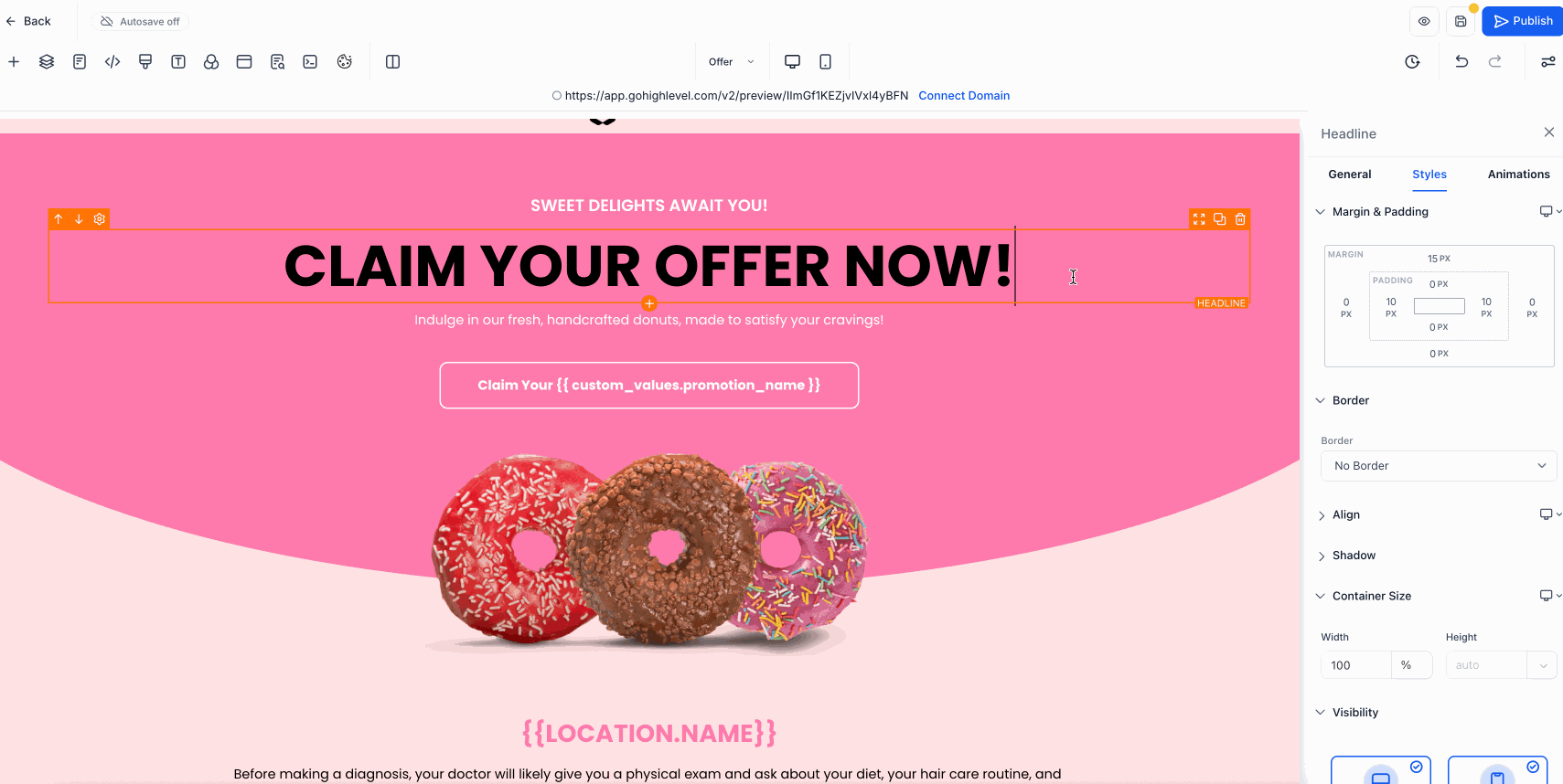
🛠️ How to Use It
- Step 1: Open your website’s page editor and select the element you want to resize.
- Step 2: Find the container size controls in the Styles section of the editor sidebar.
- Step 3: Choose your desired height and width using the unit that fits your design best — try pixels for fixed sizes or percentages to scale with the screen.
- Step 4: Adjust sizes separately for desktop and mobile if needed to make sure your site looks great on every device.
- Step 5: Use the spacing options to tidy up horizontal layouts and keep spacing consistent.
💡 Pro Tip
Fine-tuning the size and spacing of your page elements helps create a polished website that keeps visitors engaged and encourages them to explore your business further.